Site Update - New Look for TRF


If you have answers, please help by responding to the unanswered posts.
well, I'm undecided right now on the change. on the home page listed under "royal News" everything is scrunched to the right side of my screen and listed 1 word per line row going straight down the page. QUOTE]
yes I get this too - any advice?

 
Can anyone get to the non-reigning Italian royalty section from the top pull down bar?
 
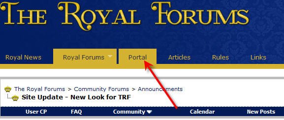
I am beginning to be totally frustrated with the new site and its opening page. :bang: I have no way to get to the portal..... My only options on the opening page are Royal News, Articles and Rules. Is anyone else having this problem?
 
I am beginning to be totally frustrated with the new site and its opening page. :bang: I have no way to get to the portal..... My only options on the opening page are Royal News, Articles and Rules. Is anyone else having this problem?

I'm sorry you're having difficulty. Are you clicking on the link to 'portal' at the top of the page? Can you describe what happens if/when you do?

trf portal link.jpg
 
I'm sorry you're having difficulty. Are you clicking on the link to 'portal' at the top of the page? Can you describe what happens if/when you do?

View attachment 276287


I have the same problem
the link "portal" is not on the front page - I first have to go to for ex a reigning house, then the ink portal is on that page (2.)
 
What browser are you using and what version is it?
eg Firefox 3.6.14, IE 8.0 etc

If you are using Internet Explorer, try clicking on Tools -> Compatability View and see if that makes a difference.
 
I am beginning to be totally frustrated with the new site and its opening page. :bang: I have no way to get to the portal..... My only options on the opening page are Royal News, Articles and Rules. Is anyone else having this problem?
There should now be a link on the homepage for the portal as well.
 
Now I've had a chance to get used to it, I just wanted to say I think the side bar on the right is a good idea, because it draws my attention to discussions taking place on other pages I usually don't visit, and has me wandering off to see what's happening there. It also helps that I know I can get rid of it if I want to.
 
I'm sorry you're having difficulty. Are you clicking on the link to 'portal' at the top of the page? Can you describe what happens if/when you do?

View attachment 276287
Sorry I didn't get back to you Janet H. I am studying full time, working full time, being a full time mum and house wife and I don't get here as often as I would like. Thankfully Interface Admin has fixed my problem and I am now able to get to the portals. :flowers:
 
Back in the old layout, I often flicked through the new threads to see if there is something interesting going on without logging on.

In the new layout, this is possible by using the Portal link but unfortunately when clicking on the latest threads there is a straight direction to the first page of the repective thread and no option to click on the last page in order to see the latest post, as it used to be.

Is this done on purpose or can it be changed? Its so much more convenient to have an option to go straight to the latest post when wanting to read an updated thread.
 
The new site is lovely! I really like the layout, it's so clean and easy to navigate! Thank you to everyone who worked on it, I know it's a big job!
 
I just noticed that the Facebook page has been updated with the new logo, it looks neat! Are the Twitter page and Articles also getting makeovers?

The Membership FAQ link on the footer bar seems to be missing.
 
Back in the old layout, I often flicked through the new threads to see if there is something interesting going on without logging on.

In the new layout, this is possible by using the Portal link but unfortunately when clicking on the latest threads there is a straight direction to the first page of the repective thread and no option to click on the last page in order to see the latest post, as it used to be.

Is this done on purpose or can it be changed? Its so much more convenient to have an option to go straight to the latest post when wanting to read an updated thread.

Yeah I am finding this change a bit annoying also. I was much easier and quicker the old way. Other than that the changes are nice.
 
Back in the old layout, I often flicked through the new threads to see if there is something interesting going on without logging on.

In the new layout, this is possible by using the Portal link but unfortunately when clicking on the latest threads there is a straight direction to the first page of the repective thread and no option to click on the last page in order to see the latest post, as it used to be.

Is this done on purpose or can it be changed? Its so much more convenient to have an option to go straight to the latest post when wanting to read an updated thread.
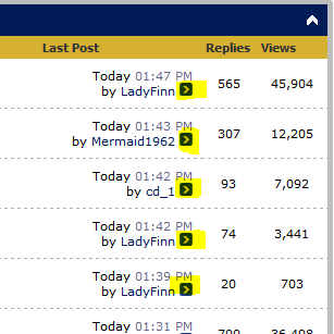
Heres an attachment, if you click the little blue box with the ">" arrow in it, it should direct you straight to the last post of that thread.

I'm not sure what you mean, but that is how you can get to the latest post. Maybe I'm just mis-reading the post though.


EDIT: I believe you might be saying that you want to go to your first unread post since your last visit? I can look into that for you. However, you can also use those arrows for the time being until I can get in to update it to work as before.
 

Attachments

  • Capture.PNG
    Capture.PNG
    11.5 KB · Views: 164
Last edited:
Heres an attachment, if you click the little blue box with the ">" arrow in it, it should direct you straight to the last post of that thread.

I'm not sure what you mean, but that is how you can get to the latest post. Maybe I'm just mis-reading the post though.

perfectly understood and yes the arrow is working, thanks!
 
I'm slightly confused about the option "Today's Posts" at the menu bar. Usually I like to scroll through the recents posts by clicking "Today's Posts" without need to sign in. In the old site it worked correctly. By clicking "Today's Posts" you had several pages containing today's and even yesterday's posts. Easy to scroll topics and check recent discussion.

How do you do that in the new site if you don't want to sign in? If you click the "Today's posts", it gives you a search box! You are not able to reach older posts than those presented on the first page of "Portal". Or am I.? :)

Only once you have logged in, you are able to see the recent posts (chronological list containing several pages), whether by clicking option called "New posts" or behind "Quick Links" > "Today's Posts".
 
Much as I like the design layout, I do find it frustrating at times to have the advert strip blocking some of the links from the forums drop down menu. I know I can choose the portal tab instead & navigate from there but why should adverts impede our use of the forums?:angry:
 
I asked the same question Elly C, and it's still happening to me. We never had the adverts before why do we have them now?
 
We never had the adverts before why do we have them now?
Well yes we did have ads before. Different ads appear in different locations (countries, regions, cities) so the ads I see won't be the same as the ones you see. Search engines determine the nature of the ads. As membership and readership of TRF increases, so does its attractiveness to advertisers.

Why are there ads in the first place? Hmm... no prize for this one. Maybe you could instead consider what is required in terms of servers, communications, software and maintenance to ensure the smooth operation of a forum of this size.
 
Last edited:
Ads provide free services to millions (maybe even billions) of people. Google, facebook and hundreds of thousands of other sites provide their services FREE by letting the advertisers pay for the cost to provide those services. We have always had ads on TRF but you might not have noticed them before. They should not be blocking the drop down menus and if they are please report back so we can find a solution.
 
It is a huge improvement. Thanks to the administration.
 
They should not be blocking the drop down menus and if they are please report back so we can find a solution.
Well as I stated in my previous post they do for me. However Warren indicates that the ads appear in different places for different users so all I can report is my own experience: If I select the tab "Royal Forums" & then choose a dropdown menu from this front page, some items on the list are inaccessible because of the ad strip. (This doesn't happen if I use the dropdown menus when I am on the Royal News front page) Does anyone else find this? I know I can navigate via the Portal front page but don't get why the adverts should be inhibiting use of the navigation tools.
 
Well as I stated in my previous post they do for me. However Warren indicates that the ads appear in different places for different users so all I can report is my own experience: If I select the tab "Royal Forums" & then choose a dropdown menu from this front page, some items on the list are inaccessible because of the ad strip. (This doesn't happen if I use the dropdown menus when I am on the Royal News front page) Does anyone else find this? I know I can navigate via the Portal front page but don't get why the adverts should be inhibiting use of the navigation tools.


Yes, me. It's same for me.
 
Hmm.. what browser are you using? For me in Firefox, the drop downs cover the ad.
 
For me it is only the banner ad which appears just beneath th e avigation tool bar. But it only blocks navigation on the one page as stated im my previous post.
 
Back
Top Bottom