
You are using an out of date browser. It may not display this or other websites correctly.
You should upgrade or use an alternative browser.
You should upgrade or use an alternative browser.
Royal Family of Portugal 2: March 2006-December 2007
- Thread starter Elsa M.
- Start date
If you have answers, please help by responding to the unanswered posts.
- Status
- Not open for further replies.
OP
OP
Elsa M.
Heir Apparent , TRF Author
- Joined
- Dec 4, 2004
- Messages
- 5,808
- City
- --
- Country
- Portugal
Hello, Dang Ayah!Dang Ayah said:Does anyone have any photo of Dona Soraya, Princesa da Beira?
The person you're referring to is not Princess of Beira. She belongs to a colateral branch Saxe Coburgo Gotha e Bragança of the Portuguese royal family, descending from D.ª Maria Pia, which is claiming the succession to the Portuguese Throne, but which is not recognized among the absolute majority of the monarchic community.
You have here the official site of these claimants, among which is Soraya Lucia Sayda Tecla:
http://www.realcasaportuguesa.org/portugues/royalfamily.html
OP
OP
Elsa M.
Heir Apparent , TRF Author
- Joined
- Dec 4, 2004
- Messages
- 5,808
- City
- --
- Country
- Portugal
Photos of the Duke and Duchess of Bragança attending the GD Couple's Silver Wedding Celebrations can be found here:
http://www.theroyalforums.com/forums/469036-post398.html
http://www.theroyalforums.com/forums/467696-post165.html
http://www.theroyalforums.com/forums/468445-post326.html
http://www.theroyalforums.com/forums/469036-post398.html
http://www.theroyalforums.com/forums/467696-post165.html
http://www.theroyalforums.com/forums/468445-post326.html
Last edited:
purple_platinum
Heir Apparent
- Joined
- Mar 14, 2003
- Messages
- 4,848
- City
- Jakarta
- Country
- Indonesia
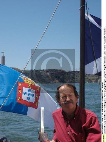
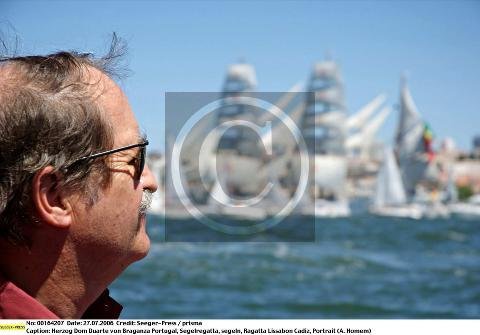
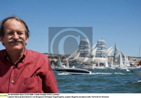
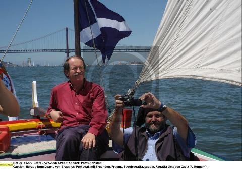
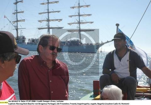
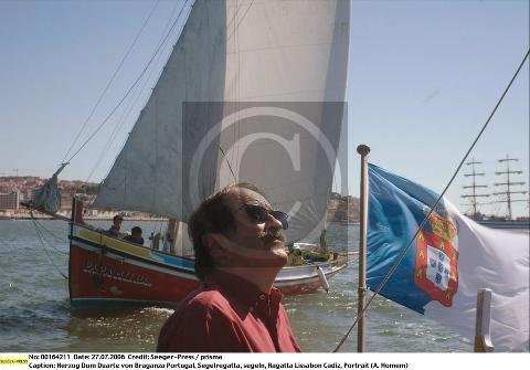
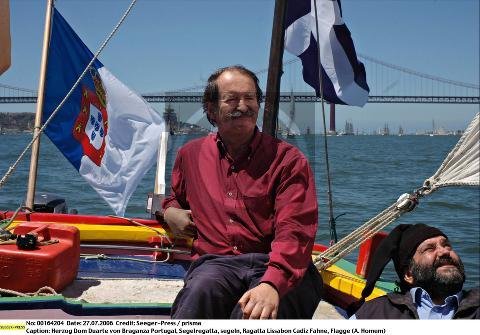
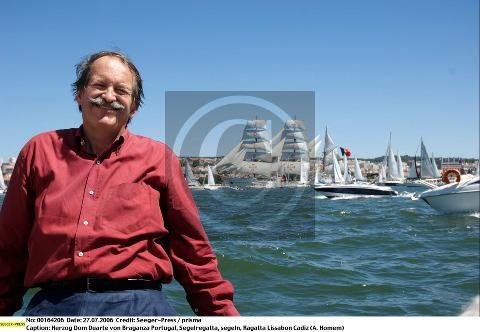
Today, 27 July 2006, Dom Duarte attended the Lisbon Regatta, in Lisbon.
pictures from seegerpress


pictures from seegerpress


Attachments
-
 pre-SEEGER00164205.jpg63.9 KB · Views: 302
 -
 pre-SEEGER00164207.jpg47.6 KB · Views: 330
 -
 pre-SEEGER00164208.jpg47.4 KB · Views: 315
 -
 pre-SEEGER00164209.jpg76.9 KB · Views: 308
 -
 pre-SEEGER00164210.jpg54.2 KB · Views: 326
 -
 pre-SEEGER00164211.jpg61.9 KB · Views: 270
 -
 pre-SEEGER00164204.jpg83.1 KB · Views: 288
 -
 pre-SEEGER00164206.jpg53.1 KB · Views: 301
Last edited by a moderator:
OP
OP
Elsa M.
Heir Apparent , TRF Author
- Joined
- Dec 4, 2004
- Messages
- 5,808
- City
- --
- Country
- Portugal
Thanks, purple platinum! ")
That is the famous Tall Ships Race, which celebrated its 50th anniversary last Sunday (July 23rd), in Lisbon. The Tejo river assembled this year 76 of the most beautiful boats in the world, coming from 19 different countries.
That is the famous Tall Ships Race, which celebrated its 50th anniversary last Sunday (July 23rd), in Lisbon. The Tejo river assembled this year 76 of the most beautiful boats in the world, coming from 19 different countries.
maidmarion
Gentry
- Joined
- Mar 3, 2006
- Messages
- 93
- City
- personal
- Country
- Canada
Can anymone explain why the Portuguese flag in the last few photos of Dom Duarte are blue and white? I know the Azores flag is such colour but the Portuguese National flag that I have seen has always been Green and Red. Might it be due to the Royal Family?
Great Piictures Purple Platinum.
Thank You so much, I am very curious about this.
MM
Great Piictures Purple Platinum.
Thank You so much, I am very curious about this.
MM
Last edited:
OP
OP
Elsa M.
Heir Apparent , TRF Author
- Joined
- Dec 4, 2004
- Messages
- 5,808
- City
- --
- Country
- Portugal
Hello, Maidmarion!maidmarion said:Can anymone explain why the Portuguese flag in the last few photos of Dom Duarte are blue and white? I know the Azores flag is such colour but the Portuguese National flag that I have seen has always been Green and Red. Might it be due to the Royal Family?
The flag you see in that picture is the monarchic flag... that's how the Portuguese flag looked like, before Portugal became a Republic. The blue and white are related to the colours of our first king's (D. Afonso Henriques) coat of arms, since his father was the Duke of Bourgogne (a French region, where he came from, in order to fight in the crusades of the XI century), before becoming Count of Portucallis.
According to the Royal Decree of 1821, when the flag was created, the two colors were chosen for being those used in the banner of the Portuguese Nation, since the very begining of the monarchy. It was also a glorification of the deeply Marianic and Catholic spirit of the Portuguese people, since it is also the color of the mantle that covers the image of Our Lady of Conception (Nossa Senhora da Conceição), the Patron of the Kingdom.
Here is D. Afonso Henriques' coat of arms, which was basically his father's blue and white cross plus the silver bezants (and which is in the origin of the five blue shields (quinas) that we have in the Monarquic and Republican flags):

The monarquic flag:

The republican falg:

Last edited:
maidmarion
Gentry
- Joined
- Mar 3, 2006
- Messages
- 93
- City
- personal
- Country
- Canada
Thank You
Wow Elsa M.,
Thank You so very much for that info. Fascinating indeed. I really appreciate it.
MM
Wow Elsa M.,
Thank You so very much for that info. Fascinating indeed. I really appreciate it.
MM
SofiaM
Newbie
- Joined
- Dec 29, 2005
- Messages
- 9
- City
- Almada
- Country
- Portugal
Elsa M,
thank you for the information on the Portuguese monarchic flag. Even being portuguese, I did not know all the details, namely that the colours of D. Afonso Henriques' coat of arms came from the Duke of Bourgogne colours.
And I appreciate so many details on the Portuguese Royal family, they are a happy family, stable and solid. I have progressively become more and more monarchic mainly because of them.
OP
OP
Elsa M.
Heir Apparent , TRF Author
- Joined
- Dec 4, 2004
- Messages
- 5,808
- City
- --
- Country
- Portugal
You're welcome, Maidmarion and Sofia!
It is indeed a very interesting subject, mainly if we keep in mind that the blue and white are deeply conected to our history and identity, unlike the green and red, which have a very recent tradition, dating just from the XX century...
Besides, and according to the basic rules of heraldry, the green and the red are two enamel colours, so they should never be in contact with one another (the heraldry allows only the fusion of enamels and metals - i.e. all the other colours with the white/silver or yellow/gold). Because of that, many heraldric scholars consider the Portuguese republican flag (as well as others like, for example, the Lithuanian one), as "heraldric mistakes"...
Last edited:
- Joined
- Aug 13, 2004
- Messages
- 27,788
- City
- São Paulo
- Country
- Brazil
Thanks for the explanation Elsa. What was the previous flag like? I think one of the earlier Portuguese flags was just like the ´inner´ part of the Portuguese coat of arms, so white, with these blue ´things´ and surrounded by the red stripes with yellow castles. I remember seeing it in an old historic cartoon book of my ex father-in-law. IMO that was the nicest flag.
Does anybody know why they chose red and green and why they did not equally divide the colours?
Does anybody know why they chose red and green and why they did not equally divide the colours?
Danny SR
Commoner
- Joined
- Jan 7, 2006
- Messages
- 30
- City
- Hillside
- Country
- United States
the flag you discribed was one of the first flags, the first one only had the blue cross with the dotts on a white cloth. the reson why the present flag is colored red and green is because those were the colors of the republican party during the monarchy. but it was not the only desing that was made up. i have lost the link but there is a site that shows the flags that were presented as possible national flags not all had the green and red, a few had the blue and white like the last flag of the monarchy. now why they didnt equally divide the colors i dont know. i do know that the last flag of the monarchy there were 2 veriations to it, one the most common and i do belive the offical was the division in the center, but the other design the division was in the same area as the present flag so it might have come from there.
This link, maybe? My knowledge of Portuguese comes from comparing it to Spanish and comparing Spanish to French, but this page has some variations.
OP
OP
Elsa M.
Heir Apparent , TRF Author
- Joined
- Dec 4, 2004
- Messages
- 5,808
- City
- --
- Country
- Portugal
Hello again!
Soon after the Proclamation of the Republic (on October 5th 1910), the new government ordered a commission, to create a new flag. The choice was not pacific at all, great polemics were created, and several proposals (26 flag projects in all, I believe) were then discussed. Here are some of them:
http://www.fotw.net/flags/pt!1910.html
Basically, there were two great proposals: those who wanted to keep the traditional blue and white colours, and the hard line republicans, which prevailed.
The final decision came with the decree of June 19th 1911, where the new national flag was finally approved, to substitute the previous one. From that moment on, this new green-red flag would be the national flag, substituting the previous one (although the blue-white one continues being used by the monarchists and, therefore, it is usually called the “monarchic flag”).
In these websites, we can see the various coats of arms of the Portuguese kings, since D. Afonso Henriques, ended up by the two national flags: the one created during the constitutional monarchy and the present one, created during the Republic:
http://pt.wikipedia.org/wiki/Bandeira_de_Portugal#c._1095_a_1139.2F1143
http://www.tuvalkin.web.pt/terravista/Guincho/1421/bandeira/pt_hist.htm
As I said above, the first national flag was created in 1821, during the constitutional monarchy. This is, truly, the first national flag, whose colours go back to our first king’s coat of arms (vd. my first post, for the justification of the choice of the colours).What was the previous flag like?
Soon after the Proclamation of the Republic (on October 5th 1910), the new government ordered a commission, to create a new flag. The choice was not pacific at all, great polemics were created, and several proposals (26 flag projects in all, I believe) were then discussed. Here are some of them:
http://www.fotw.net/flags/pt!1910.html
Basically, there were two great proposals: those who wanted to keep the traditional blue and white colours, and the hard line republicans, which prevailed.
The final decision came with the decree of June 19th 1911, where the new national flag was finally approved, to substitute the previous one. From that moment on, this new green-red flag would be the national flag, substituting the previous one (although the blue-white one continues being used by the monarchists and, therefore, it is usually called the “monarchic flag”).
In these websites, we can see the various coats of arms of the Portuguese kings, since D. Afonso Henriques, ended up by the two national flags: the one created during the constitutional monarchy and the present one, created during the Republic:
http://pt.wikipedia.org/wiki/Bandeira_de_Portugal#c._1095_a_1139.2F1143
http://www.tuvalkin.web.pt/terravista/Guincho/1421/bandeira/pt_hist.htm
Last edited:
OP
OP
Elsa M.
Heir Apparent , TRF Author
- Joined
- Dec 4, 2004
- Messages
- 5,808
- City
- --
- Country
- Portugal
The new flag
The Commission in charge of creating the new flag gave a very fragile justification for the choice of colours. They based their arguments in a symbolic reading, rather then heraldric principals (which were very fragile, as I showed in post above). According to the official explanation, the red was chosen for being the militant colour par excellence (since it remembers the blood and it inspires feelings of victory), while the green would be the colour of hope.
The truth, however, is that they were colours without great historical tradition (some scholars say they were related to the colours of two major military orders – the Order of Christ, whose cross was red, and the Order of Avis – but I doubt the Republicans were considering that, when they chose the red and green…) and, as we can see, hardly could the Commission justify its inclusion in the Flag.
It seems more plausible that the two basic colours were related to the Carbonari (a secret, revolutionary society that flourished in Italy, France, Portugal and Spain early in the 19th century, in the fashion of the Freemasonry), since green and red are the colours of the mantle that covers the image of Saint John the Evangelist, the patron of the Carbonari (and that’s why they are also the colours of the Italian flag).
About the partition of the two basic colours, I believe this ratio was also related to the flag of this secret society, since the Carbonari’s flag was 2/5 red and 3/5 green, while the Portuguese flag is 2/5 green and 3/5 red...
(As Danny says however, the monarchic blue & white flag, in its version for naval use, had already a 1/2 partition, while the flag for terrestrial use was equally divided. I don't think they are related though, since they were different partitions, but I'm not an expert)
The link provided by Kelly9480 is preciselly about the right proportions and it exemplifies how the Portuguese shall not be represented.
Besides this choice of colours, the Commission also decided to keep, in the essential, the same representative emblems of the Nation that already appeared in the previous blue & white flag. For the lovers of heraldry, these are truly the important symbolic elements, since the historical continuity of the Nation is represented mostly in there, rather than in the colours.
Here’s a brief resume of those symbols, which were basically the ones transferred from the blue & white flag to the red & green one, except for the crown (that was eliminated in the second flag, for obvious reasons):
1. the yellow/gold armilla (esfera armilar), which was adopted as the personal emblem of D. Manuel I, and is present in the national emblems since then. It symbolizes the Portuguese Discoveries and the most shining period of our History;
2. the white/silver shield sprinkled by the blue shiels (quinas), each one with five silver beasants (in memory of the five sore of Jesus Christ that, according to the legend, appeared in a vision to D. Afonso Henriques, during the first battles for the Portuguese nationality);
3. a crimson wide band that surrounds the white shield, over which are placed the seven yellow/gold castles (which represent the Muslim kingdoms the Portuguese had to fight in the beginning of the nationality).
Last edited:
Avalon
Heir Apparent
- Joined
- Nov 21, 2005
- Messages
- 5,902
- City
- Yerevan
- Country
- Armenia
That's very interesting, Elsa! So fascinating to know the story of how/why the new flag was chosen and what it symbolizes. Not talking about the possible hidden reasons behind it! 
That was a great explanation!
That was a great explanation!
OP
OP
Elsa M.
Heir Apparent , TRF Author
- Joined
- Dec 4, 2004
- Messages
- 5,808
- City
- --
- Country
- Portugal
You're welcome, Avalon!
Well, in these things, there are never absolute truths, but I hope it served at least to get a general idea of it...
Oh, and I forgot to say this, I believe the flag Marengo was describing was one of the personal flags/standards used by the various Portuguese kings (especially the last ones)... Was it any of these, Marengo?
http://pt.wikipedia.org/wiki/Bandeira_de_Portugal#c._1095_a_1139.2F1143
purple_platinum
Heir Apparent
- Joined
- Mar 14, 2003
- Messages
- 4,848
- City
- Jakarta
- Country
- Indonesia
The Bragança family is on holiday in the archipelago of Açores, Portugal
Here are the pictures from seegerpress :
Dom Duarte, Duke of Bragança, and Duchess Isabel


At the Açores Glacier (Furnas)


more pictures
http://www.seegerpress-online.de/topixx/data/pre-SEEGER00165008.jpg
http://www.seegerpress-online.de/topixx/data/pre-SEEGER00165009.jpg
http://www.seegerpress-online.de/topixx/data/pre-SEEGER00165010.jpg
Infanta Maria Francisca, Prince Afonso and a friend
http://www.seegerpress-online.de/topixx/data/pre-SEEGER00165022.jpg
http://www.seegerpress-online.de/topixx/data/pre-SEEGER00165021.jpg
Infanta Maria Francisca
http://www.seegerpress-online.de/topixx/data/pre-SEEGER00165023.jpg
at the beach


http://www.seegerpress-online.de/topixx/data/pre-SEEGER00165017.jpg
http://www.seegerpress-online.de/topixx/data/pre-SEEGER00165015.jpg
http://www.seegerpress-online.de/topixx/data/pre-SEEGER00165016.jpg
Infante Dinis de Bragança
http://www.seegerpress-online.de/topixx/data/pre-SEEGER00165020.jpg
Prince Afonso de Bragança
http://www.seegerpress-online.de/topixx/data/pre-SEEGER00165019.jpg
http://www.seegerpress-online.de/topixx/data/pre-SEEGER00165014.jpg
Infanta Maria Francisca de Bragança
http://www.seegerpress-online.de/topixx/data/pre-SEEGER00165018.jpg
Last edited by a moderator:
OP
OP
Elsa M.
Heir Apparent , TRF Author
- Joined
- Dec 4, 2004
- Messages
- 5,808
- City
- --
- Country
- Portugal
Thanks for the photos, Purple_Platinum! The archipelago of Açores is a very beautiful place, where the Nature is still untouched. The photos were taken in the island of S. Miguel, where the Furnas (a mud volcano) are placed: http://www.travel-images.com/raa3.html
They seem to have arrived these days in Açores, since D. Duarte was performing an act last Monday in the continental part of the country.
http://www.diarioleiria.pt/10907.htm
The village of Batalha paid last Monday, August 14th, a homage to D. João I,. The ceremony took place at the Chapel of the Founder, in the Monastery of Santa Maria da Vitória, where António Leite da Costa (from the Historical Society of the Independence of Portugal) evoked some passages of our History. D. Duarte, the Duke of Bragança, was one of the guests and placed a crown of flowers on the grave of D. João I.
purple_platinum
Heir Apparent
- Joined
- Mar 14, 2003
- Messages
- 4,848
- City
- Jakarta
- Country
- Indonesia
Elsa, there are more pictures from Deadline Press (which is basically sames like the seegerpress ones but with bigger & less watermark). Here's the link :
20060800 - Portugal - Açores
Dukes of Braganca on their holidays in Azores portuguese islands with their three children : Francisca, Dinis and Alfonso
20060800 - Portugal - Açores
Dukes of Braganca on their holidays in Azores portuguese islands with their three children : Francisca, Dinis and Alfonso
Danny SR
Commoner
- Joined
- Jan 7, 2006
- Messages
- 30
- City
- Hillside
- Country
- United States
thanx for the lovely pics. i must say that they are one of the most if not the most down to earth royal family today. a family that seems to be very united, and you can see the love that exsists in that family. i might be a bit bias is i am portuguese and have a great love and admeration for our royal family but compared to other i must say i see alot of love there somethin which is not always seen in some other families.
OP
OP
Elsa M.
Heir Apparent , TRF Author
- Joined
- Dec 4, 2004
- Messages
- 5,808
- City
- --
- Country
- Portugal
http://da.campodosmedia.com/jornal/?link=noticia&id=3266
The town of Beja will host, next September 22-24th, the 13th Congress of the Royal Cause. More than 200 monarchists, among congressmen and observers, are waited during the three days.
The Royal Cause is the federacy of the various royal associations existing in Portugal and abroad. It is presided by D. Duarte de Bragança and it intends to congregate all the sympathetical and political sensibilities of the royal institution.
This year's edition is dedicated to doctrinal reflection. While the meetings will be congregated at the Diocesan Seminary of Beja, several other events are also appointmented to take place in other parts of the town, where the blue and white monarchic flags are expected be spread.
The event will count on the presence of the Duke of Bragança who, according to José Gaspar, "is going to participate in diverse initiatives related to the congress".
Last edited:
OP
OP
Elsa M.
Heir Apparent , TRF Author
- Joined
- Dec 4, 2004
- Messages
- 5,808
- City
- --
- Country
- Portugal
The Duke of Bragança is going to present the players of the Portuguese football team with the Order of Nossa Senhora da Conceição de Vila Viçosa, of which he is the Great-Master.
Although the ceremony always takes place on the holliday of December 8th (when the Patronness of the Country is celebrated), D. Duarte will advance it to next week, so it can be possible to have all the players assembled.
The Ordem de Nossa Senhora da Conceição is an honorific dinastic order created by D. João VI in 1818, whose members own the title of Cavaleiros (Knights). Its hashmark is hanged on a blue and white band and it is made up of a crowned medallion, in form of star, and a circle with the inscription "Padroeira do Reino" (Patroness of the Kingdom).

Last edited:
Danny SR
Commoner
- Joined
- Jan 7, 2006
- Messages
- 30
- City
- Hillside
- Country
- United States
that is very nice of the duke, theteam does deserve all the credit and apretiation they get. they did a very good job this year. but one question, do you know which degree they will recive, if im not mistaken there are several degrees in the order.
OP
OP
Elsa M.
Heir Apparent , TRF Author
- Joined
- Dec 4, 2004
- Messages
- 5,808
- City
- --
- Country
- Portugal
I understand they will get the degree of "Cavaleiros" (Knights). It's not a noble, nor a State title (to which D. Duarte could only access if he was king of Portugal); just an honorific distinction. This kind of dinastic orders (e.g. the Ordem de Nossa Senhora da Conceição de Vila Viçosa, the Ordem de Santa Isabel, etc.) have much of a religious nature, and that's why the Vatican recognizes the Head of the Portuguese Royal House as it's Great-Master, despite Portugal being a republic.
Last edited:
OP
OP
Elsa M.
Heir Apparent , TRF Author
- Joined
- Dec 4, 2004
- Messages
- 5,808
- City
- --
- Country
- Portugal
http://jn.sapo.pt/2006/08/31/desporto/queremos_vencer_o_europeu.html
Dom Duarte Pio, Duke of Bragança, granted the medal of the Ordem de Nossa Senhora da Conceição de Vila Viçosa to all the players and staff of the national football team, for the outstanding performance during the last World Championship. The private cerimony, which took place out of the press' eye, happened yesterday in the Amazónia Hotel of Jamor (Lisboa), at 9:00 PM, after dinner.
http://www.correiodamanha.pt/noticia.asp?id=213173&idselect=21&idCanal=21&p=200

Last edited:
OP
OP
Elsa M.
Heir Apparent , TRF Author
- Joined
- Dec 4, 2004
- Messages
- 5,808
- City
- --
- Country
- Portugal
http://www.gazetacaldas.com/Desenvol.asp?NID=15302
The Duke of Bragança is going to participate in the 17th Edition of the Castro Laboreiro Dog Exhibition that is going to take place in the village of Óbidos, next September 9th.
http://www.jornaldeleiria.pt/index.php?article=3145&visual=1
D. Duarte de Bragança participated in the commemorative acts of the Battle of Aljubarrota (1385) that took place last week. Despite arriving late at the cerimony, the claimant to the Portuguese Throne was one of the few people that had a seat at the tribune, along with the official authorities...
maidmarion
Gentry
- Joined
- Mar 3, 2006
- Messages
- 93
- City
- personal
- Country
- Canada
Holidays in the Azores
Thanks everyone for all the recent information and photos posted about the the royal family "holidaying" in the Azores. I have relatives living there in Sao Miguel and it is so nice to hear that the Royal family chose such a terrific place within Portugal to spend their holiday. I have been away for a few weeks and have been unable to catch up on recent goings on. Thanks again everyone, your contributions are so intriguing.
MM
Last edited:
tdarlene
Courtier
- Joined
- Jul 25, 2005
- Messages
- 687
- City
- Lagos
- Country
- Portugal
There´s an interview of D. Duarte in Just Leader magazine this month. It is a realy nice interview, because D. Duarte talks about the situation in Portugal and how it could be differente if Portugal were a monarchy.
- Status
- Not open for further replies.
Similar threads
- Sticky
- Replies
- 8
- Views
- 1K
- Replies
- 8
- Views
- 5K
- Locked
- Replies
- 0
- Views
- 3K
- Replies
- 393
- Views
- 82K
Latest posts
-
 Princess Catharina-Amalia, Princess of Orange, Fashion & Style Part 2: June 2024 -
- Latest: CrownPrincessJava
-
 Princess Charlene's Fashion and Style Part 20: September 2024 -
- Latest: Moonmaiden23
-
